
The Power of Salesforce KPI Dashboards
Reports in Salesforce offer an excellent way to visualize the data. However, to truly unlock the potential of visual analytics, you have to try Salesforce Dashboards.
Graphical Representation with Dashboards
Salesforce Dashboards present reports in a graphical manner. Using data from source reports, they display visual components that capture an organization’s primary metrics and performance indicators. The beauty of these Salesforce KPI reporting tools is their adaptability: Users can tailor components to best represent their data and highlight vital KPIs.
- Driving Organizational Goals with Accurate KPIs
It’s crucial for an organization’s trajectory that leaders maintain a clear and current understanding of its KPI data. This knowledge is foundational to informed decision-making. When KPIs are selected and continuously monitored, they arm the leadership with essential insights. The final step is to present these metrics effectively, steering the organization toward its objectives.
- Advanced Filtering for Customized Views
Salesforce KPI Dashboard filters let users apply diverse data perspectives to their dashboards. Once filters are set, viewers can pick a filter that zeroes in on their data of interest. A notable feature is that Salesforce retains this filtered view, presenting it during the viewer’s subsequent dashboard visits.
- Stay Updated with Automatic Refreshes
One of the important features is the automatic dashboard refresh. Users can configure these and get dashboard updates directly in their email, based on a predetermined schedule. For example, by subscribing to the Sales Overview dashboard, a user can get the latest Salesforce KPI dashboard insights every Monday at 8:00 AM, streamlining their weekly reviews.
- Maximizing Dashboard Utility
Salesforce KPI Dashboards aren’t just about visuals; they’re about optimization. Users can integrate as many as 20 different components on their dashboard, ensuring a comprehensive view of their performance metrics.
Dashboard Set Up
Crafting a dashboard in Salesforce requires meticulous attention. Such dashboards empower users to monitor, evaluate, and showcase pivotal performance indicators, both retrospectively and concurrently. To design a KPI Dashboard, follow these steps:
Initial Preparations
Before initiating dashboard creation, it’s crucial to have a deep understanding of the data you aim to showcase. Identify the specific reports that will feed into your dashboard components.
Insight:
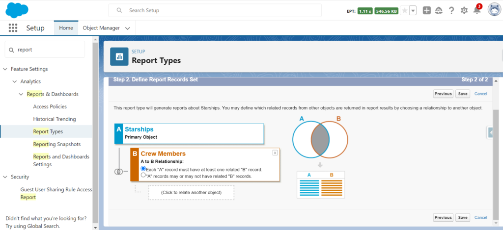
In Salesforce, before generating reports for custom objects, it’s advisable to first establish a custom Report Type.
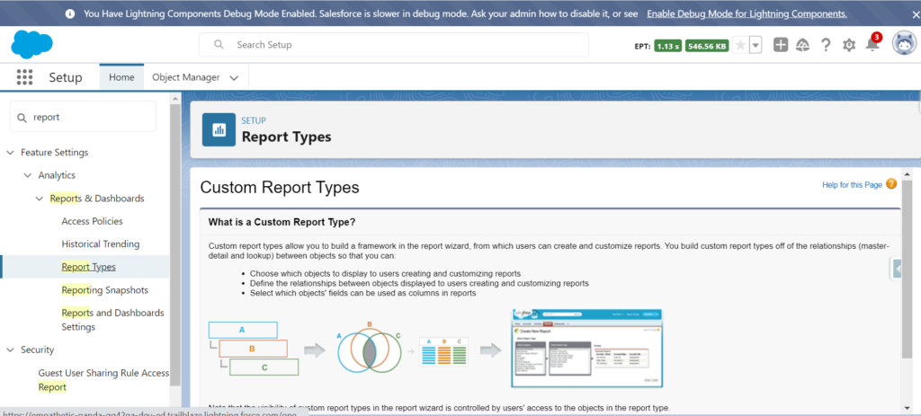
Select Report Types and then click New Custom Report Type:
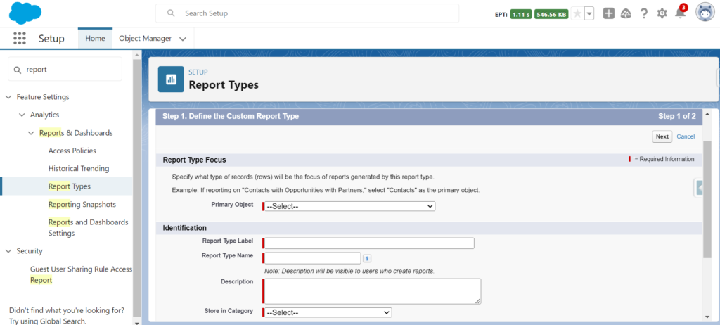
Select source Object for reports.
Also, you need to create reports that will represent visual data in your dashboard.
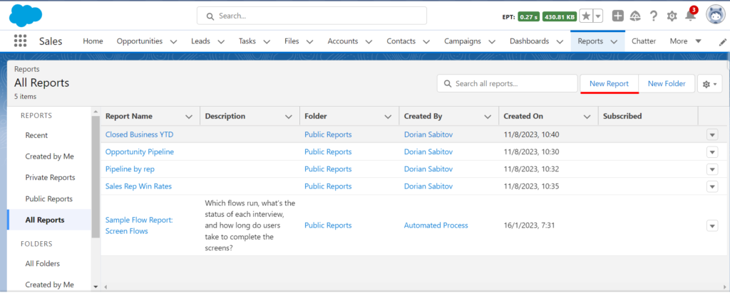

Choose New Dashboard and then click on it. Complete all necessary fields and select Create.
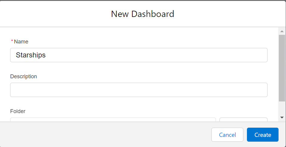
Add Components to Dashboard:
Click on Add Component, then choose the report to be incorporated into the dashboard.
Pick your preferred visualization (e.g., chart, table, gauge).
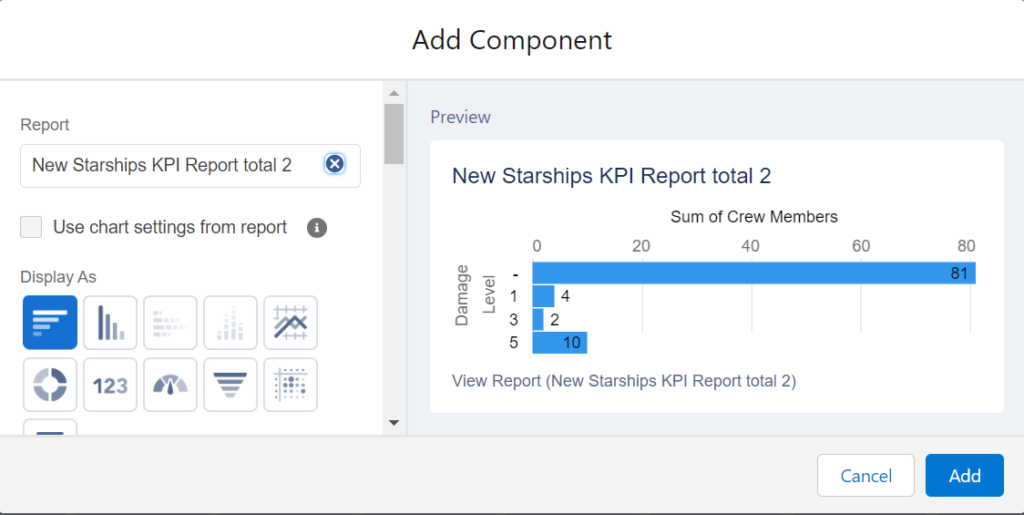
Customize the layout of your dashboard:
Rearrange the components on your dashboard by dragging and dropping them. If you need to resize any component you can make use of the handles provided. Personalize your dashboards title, theme and visual preferences through the settings panel.
Add Filters (optional):
Click on the Add Filter button if you want to allow viewers to filter dashboard data based on certain criteria, like date range, region, product, etc.
Save & Run:
Once you’re finished with the layout and components, click Save, then click Run to view the dashboard with real data.
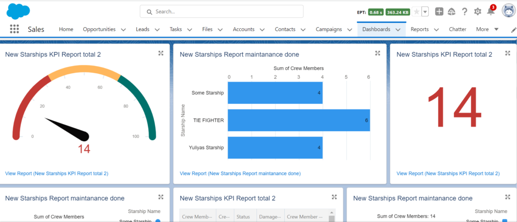
Insight:
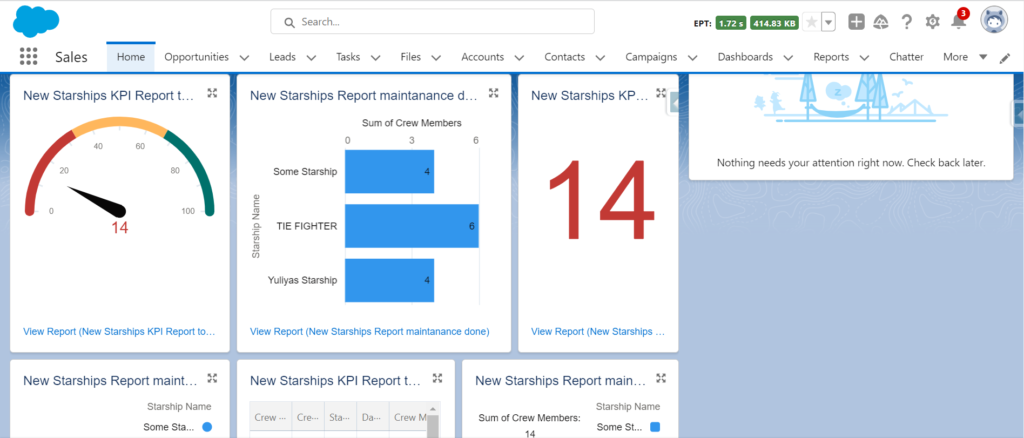
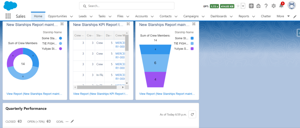
You can add a dashboard to the Org or App homepage.
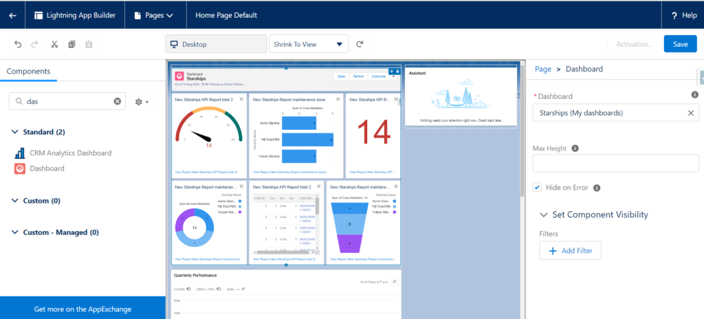
How to distribute a dashboard (optional):
Click the dropdown beside the ‘Edit’ button and choose Share, don’t forget to decide who can see or modify the dashboard.
Schedule Refreshes (optional):
Working with large volumes of data that might impact system performance, to prevent this you can schedule refreshes during off-peak times:
- Click on the dropdown next to the Edit button.
- Select and press Schedule Refresh.
Insight:
Remember, the efficacy of Salesforce KPI dashboard relies on the quality of reports. Ensuring accurate, up-to-date reports that represent your data is pivotal. Regular reviews and updates to dashboard ensure alignment with business objectives. If limitations arise or advanced visualizations are required you need to explore third-party integration tools for KPI reports in Salesforce.
Leveraging Third-Party Apps from AppExchange for Enhanced Salesforce Dashboards
Introduction to AppExchange:
AppExchange is Salesforce’s marketplace for cloud-based applications. It’s a reservoir of apps, components, and more that extend Salesforce into every department and industry. These solutions cater to a variety of needs, and when it comes to dashboards, there are several third-party apps that can significantly enhance a user’s experience and capabilities.
Why Use Third-Party Dashboard Apps?
While Salesforce offers robust native dashboarding capabilities, sometimes specific requirements or complexities necessitate the use of specialized tools. Third-party dashboard apps often provide:
Enhanced visualization includes improved kinds of graphs, dynamic charts, and more interactive presentations.
- Extended Customization: Offers finer-grained dashboard customization choices than the normal Salesforce customization options.
- Integration Capabilities: Seamless blending of data from outside Salesforce, such as ERP systems, external databases, or other cloud services.
Popular Third-Party Dashboard Apps
Salesforce CRM Dashboards
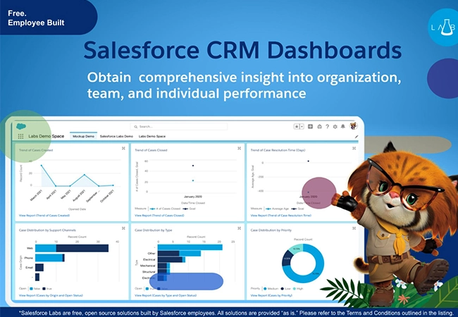
Salesforce CRM dashboards offer pivotal data insights that drive business success. By harnessing the potential of these dashboards, businesses can refine decision-making, bolster collaboration, and elevate customer experiences. While there might be certain limitations and expenses tied to their use, the advantages they present position them as an essential tool for enterprises aiming for informed progress.
Tableau
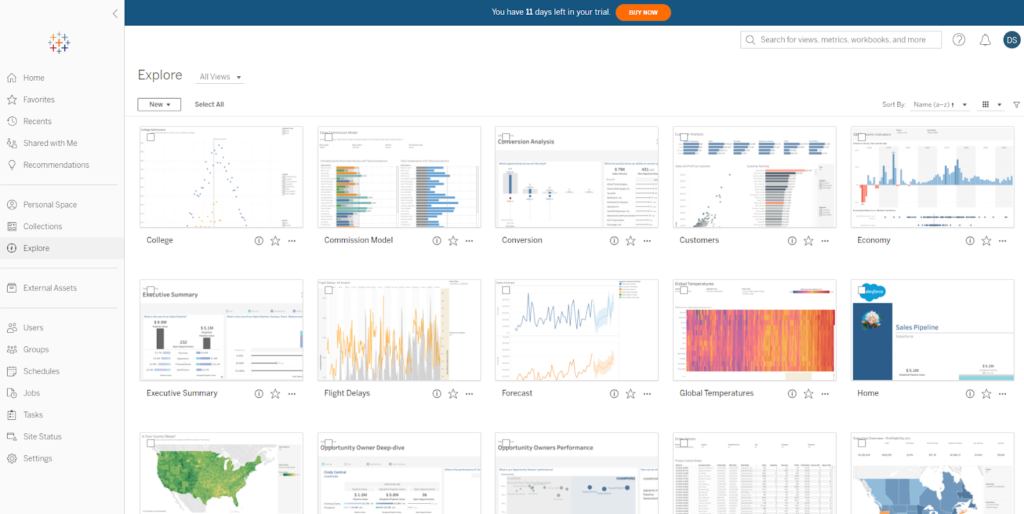
Tableau desktop reviews offer a wide array of visualization tools, suitable for different needs. Whether you’re looking to present data to an audience, craft interactive panels, or design eye-catching infographics, Tableau has you covered. It supports a variety of visualization types, from standard charts to detailed maps and scatter plots.
Additionally, Tableau’s dynamic functionalities enable users to deeply engage with their data. They have the capability to zoom into particular data details, sift through irrelevant data, and adapt visualizations on the go. This lively environment fosters spontaneous data exploration, allowing users to inquire and instantly gain insights, fostering a richer, team-oriented understanding of data. Furthermore, with Tableau’s seamless live data source integration, visuals remain in sync with the freshest data, ensuring up-to-date insights every time.
Value Analytics
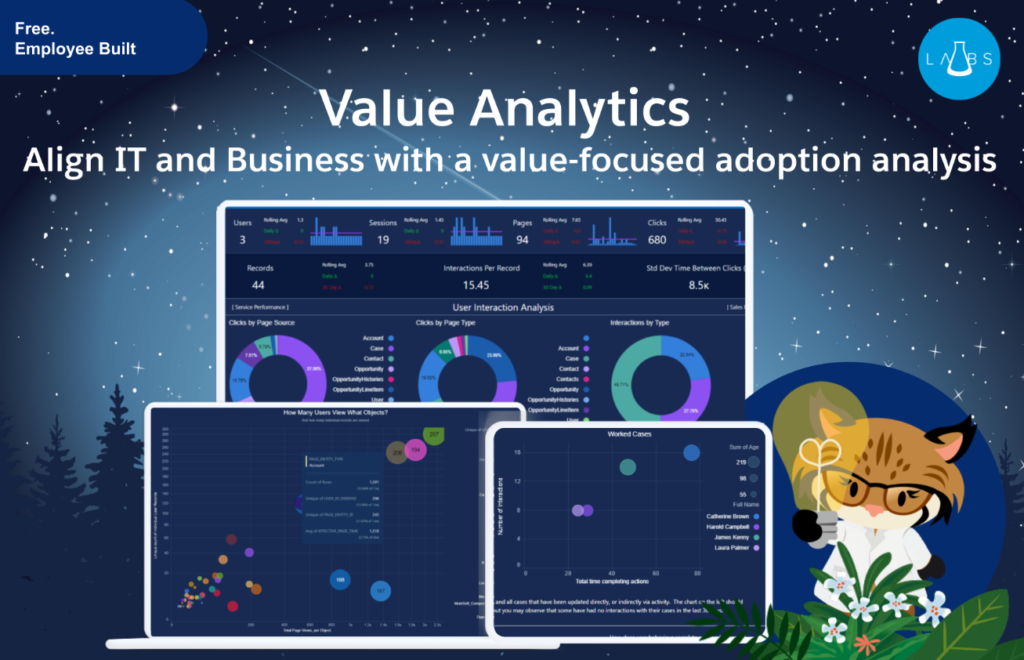
Information overload is avoided thanks to Salesforce Analytics Studio, which presents an all-encompassing look at user activity, key performance indicators, and optimization opportunities. Information at hand allows you to optimize business targets through improved user experience and process excellence.
Monitoring metrics related to specific parts of your product experience requires no more than using a value analytics app. Data points are carefully aligned with operation metrics to give comprehensive insight into user progress in relation to corporate objectives.
Clear technical issues related to your business goals are part of what the Value Analytics App offers. Having an awareness of these factors allows you to prioritize actions crucial to your company’s extensive growth.
Advantages, to using third party applications:
- Time saving: Many third party software options come with built templates and drag and drop features allowing users to set up their dashboards quickly and efficiently.
- Increased user engagement: The use of interactive dashboards can encourage users to interact frequently with Salesforce within the organization ultimately boosting user popularity.
- Flexible pricing options: In the future it is possible that certain solutions may offer alternatives to native Salesforce solutions making them particularly appealing to smaller businesses or specific industries.
FAQs on Building Custom Dashboards in Salesforce
How to Create KPI Dashboard in Salesforce?
To create a KPI dashboard in Salesforce, start by navigating to the Dashboards tab in your Salesforce CRM. Click on the ‘New Dashboard’ button and give your dashboard a name and description. You can then add components such as charts, gauges, tables, or metrics by selecting the ‘Add Component’ option. Choose the source report for each component, set the display properties, and configure filters to tailor the dashboard to show key performance indicators relevant to your business needs. Remember to save and refresh the dashboard to see live data.
What are the Best KPI Dashboards for Small Businesses?
The best KPI dashboards for small businesses typically focus on financial metrics, customer engagement, and operational efficiency. Financial dashboards should include KPIs like cash flow, revenue growth, and profit margins. Customer engagement dashboards might track metrics like customer acquisition cost, retention rates, and net promoter scores. Operational dashboards could monitor inventory turnover, order fulfillment rates, and employee productivity. Salesforce allows for customization to suit specific industry needs, making it easier for small businesses to monitor their most critical metrics.
How to Add Component in Dashboard Salesforce?
To add a component to a dashboard in Salesforce, go to the dashboard you want to modify and click ‘Edit’. In the dashboard edit mode, select ‘Add Component’ to bring up the list of available report components you can add. Choose the report that serves as the data source for the component you want to include. After selecting the report, choose the type of component (chart, table, gauge, etc.), configure its properties, and specify how data should be displayed. Adjust the size and placement of the component within the dashboard layout, then save your changes.
What are the Different Types of Dashboard in Salesforce?
Salesforce offers several types of dashboards to cater to different business needs and user roles. The main types include:
- Operational Dashboards: These are used for day-to-day monitoring of business operations, displaying real-time data that is frequently updated.
- Analytical Dashboards: Focused on deeper analysis, these dashboards help in understanding trends, patterns, and long-term changes in data. They often include complex calculations and data from multiple sources.
- Strategic Dashboards: Used by senior management to track strategic metrics that influence business decisions. These dashboards typically focus on high-level KPIs and long-term data.
- Tactical Dashboards: These are used by middle management to monitor and measure departmental performance and operational processes. Each type of dashboard in Salesforce can be customized extensively to fit the specific needs of the organization, leveraging Salesforce’s robust data management and visualization capabilities.
In Conclusion:
Salesforce serves as a fundamental tool for companies to display and understand their data because of its integrated dashboarding features. Salesforce dashboards offer a complete lens to understand important KPIs and successfully align business goals. However, the enormous selection of third-party applications available on AppExchange gives even more in-depth views, complex visualizations, and wide-ranging customization opportunities, guaranteeing that businesses have the freedom to customize their data representation in accordance with their particular needs.

Dorian is a 6X Certified Salesforce Developer and Administrator with a start in the IT world as a CRM Admin in 2020. Since diving into Salesforce in 2021 via Trailhead and Focus on Force, he has achieved a Ranger Rank, earned several Superbadges, and bagged certifications including the Salesforce Certified Platform Administrator, Platform App Builder, Platform Foundations and Platform Developer by 2023. In 2024 he also became Salesforce Certified AI Associate and earned Agentforce Specialist Certification in 2025. Dorian is very keen on continuous learning, always looks for fresh ways to improve his knowledge. He enjoys running, boxing, kickboxing and reading diverse kinds of books in his free time.




 Previous Post
 Next Post
When you are choosing third-party apps from Salesforce AppExchange to boost your Salesforce dashboards, keep these points in mind:
Compatibility: Make sure the app fits well with your Salesforce setup, enhancing functionality without any hiccups.
Ease of Use: Pick apps with straightforward, easy-to-navigate interfaces to encourage your team to use them.
Customization: Opt for apps that let you tweak and tailor features to suit your specific business needs.
Security: The app must be secure and comply with laws like GDPR or HIPAA, especially if you deal with sensitive data.
Performance: Choose apps that run smoothly and can grow with your business without slowing down your system.
Support: Look for apps supported by reliable customer service and regular updates to ensure they keep serving your needs over time.
User Feedback: Check out reviews and ask around for personal experiences to gauge how well the app performs in real scenarios.
Cost vs. Value: Consider whether the app’s price is worth the benefits it offers to your business, both now and in the future.
In short, the right app should seamlessly integrate with your system, be easy to use, customizable, secure, scalable, well-supported, well-reviewed, and offer good value for your investment.
Hope it helps!
Dorian